Struggling to create effective compositions? Nigel Forster outlines a simpler approach to help achieve striking images
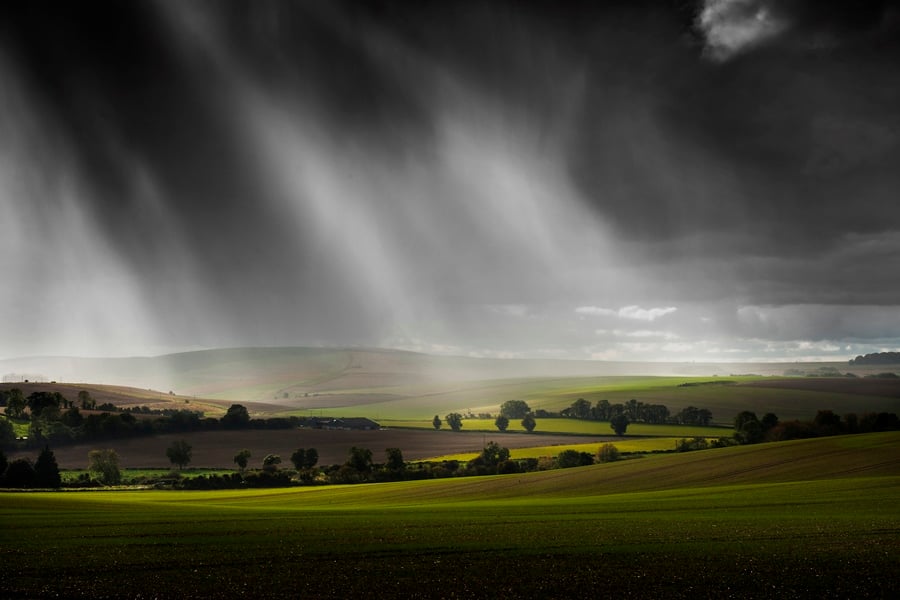
All images by Nigel Forster
Do your images suffer from unwanted clutter? Do they struggle to convey what it was that caught your eye when you first looked at the scene in front of you? Do they lack that impact you’re looking for? If so, three simple guidelines can improve your photography significantly.
The first question to ask yourself is “Why am I taking this picture?” Your next task is to do everything you can to convey this to the viewer of your image through effective composition; think of composition as designing the image or organising features in the frame.
Here are four simple guidelines for ensuring that you have the maximum chance of achieving this...
Be selective: Only include what adds to the composition, and leave out what detracts, cropping if you need to. Distracting features are not only obvious things like cars, power lines, litter and the like, but anything that draws the eye away from your reason for taking the picture.
Thinking in abstract: Whatever your subject, how does your image appear in shape, form or colour? Try to get away from the idea of simply going to a great place to take a picture from; it limits the potential for individuality and creativity and at best you’ll get a variation on what has been taken before. Try to explore with your camera, and create your own compositions from what’s around you.
Choosing your viewpoint (point of view): This refers to the placement, direction and orientation you of your camera. An example could be a low viewpoint, held in portrait format (i.e. vertically), with the camera pointed up to the sky. Try varying your point of view to achieve a variety of interesting compositions. You’ll find that a small change of viewpoint can make a big difference to the impact of your image.
Choosing your moment: Light and weather are vital in landscape photography. Mist, skies, snow and other conditions can dramatically change the composition of an image. It is well known that dawn and dusk light are favoured by photographers, and that flat midday light rarely produces the best results, but don’t dismiss the variety of images you can get in all kinds of lighting conditions.
Let’s go through a few of these guidelines in practice...
Be selective
Something must have caught your eye and made you say: “I want to take a picture of this.” However, your view likely has a lot of features and elements to it. Think carefully about what you want to include in the image (what contributes to your composition) and what you want to leave out (what detracts).
Sheep in the Brecon Beacons: What caught my eye here was the simple question mark or “s” shape that the sheep made.
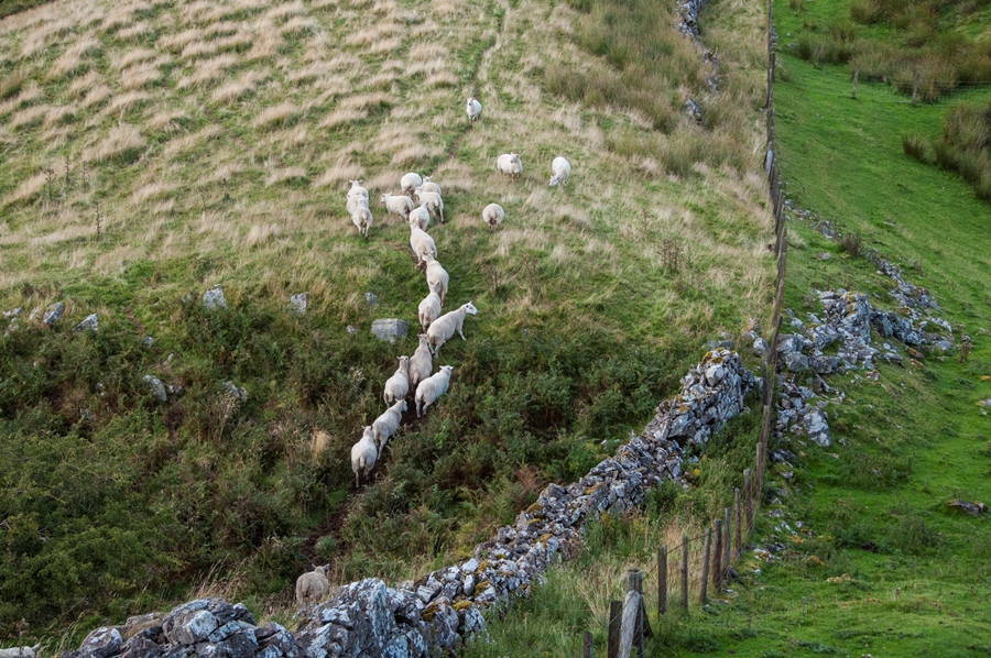
My first picture, above, had a slightly wider view encompassing a wall, a fenceline and an adjacent field, all of which were detracting from the image. At the time, the sheep were also not walking in a line that worked particularly well.
I decided that the shape formed by the sheep was the key thing that would make this image. I zoomed in (though could have cropped afterwards of course) and composed with just the sheep in the frame, the result being the image below.
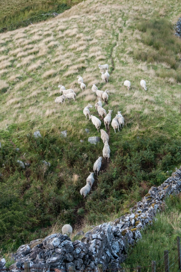
For the final image, I cropped out the section of wall on the bottom right and converted to black and white to emphasise the sheep more strongly.
Landscape features: The two images below have two simple features and nothing else to clutter the image.
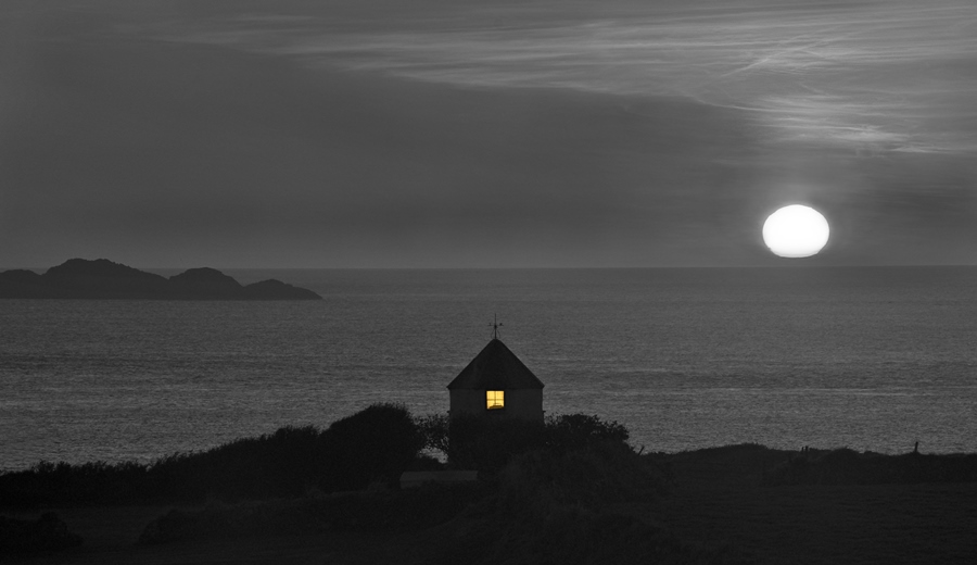
Notice that each is arranged so that the features are set up on a diagonal.
Line of trees: It was the symmetry of the line of trees and the backlighting through them that I saw as being important for this image.
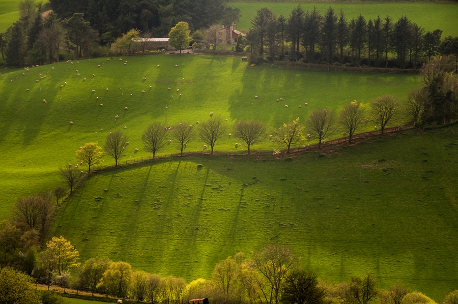
In the uncropped original, above, the farmhouse and trees at the bottom detracted from this, so I composed the image to exclude all other features. If you look carefully you’ll also notice some judicious cloning in the final image!
I keep features in the frame to a minimum and try to do this by being selective in camera. However I’m not against some tidying up to remove minor (usually man-made) features if I think they detract. These may be temporary (such as cars, people or litter) or they may be permanent (i.e. telegraph poles and litter bins). If you look carefully at the two examples above, you’ll see that the telegraph pole, the wire and a number of the muddy areas of the field have been removed.
Thinking in abstract
Every image you take is made up of shapes, colours or patterns. Try to think of your image in these terms, rather than in terms of what you’re taking and where you’re taking it. Look at the examples below; their strength is drawn from simplicity of composition, and from thinking of the subject in abstract rather than content.
Wavy lines: The images below are of larch trees in snow and rice terraces respectively.
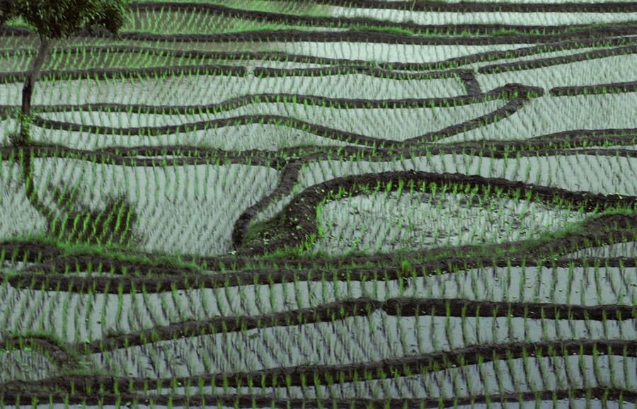
But they draw their strength from the fact that they form a simple pattern of wavy lines and a predominant colour.
Two rectangles: The subjects are different – one depicting a field of rapeseed with trees on the horizon, the other an oil refinery against the backdrop of a sunrise.
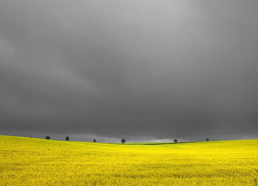

But in terms of the way the images are constructed, they are both two rectangles with a feature on the horizon line.
Viaduct and greenhouse roof: Although the below images are of different subjects, their key elements are the same: a dominant diagonal, with perspective lines leading to it.
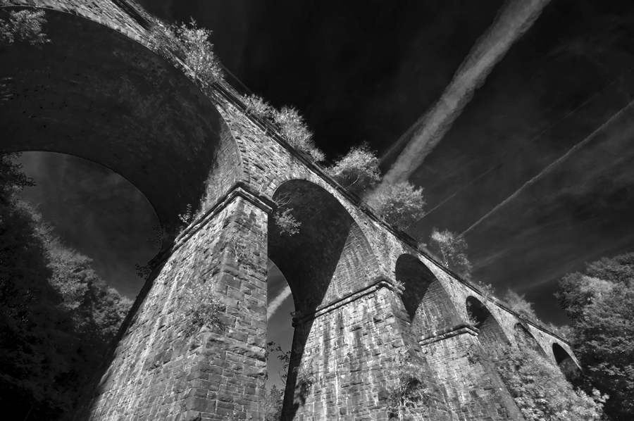

I use diagonals regularly, as the images they create are often dynamic and especially suited for architecture photography.
Single peak with textured foreground: Another example can be found in the two portrait-format images below.
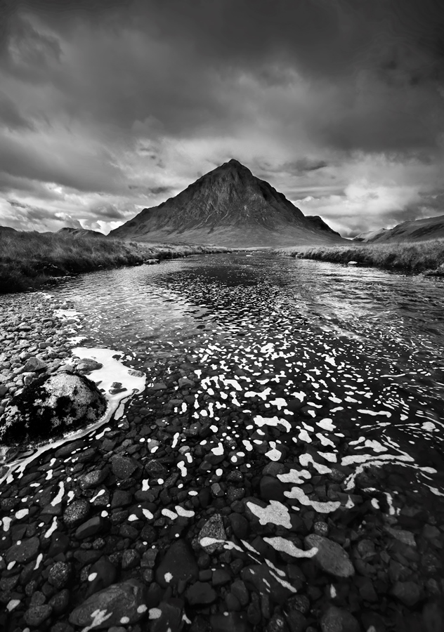
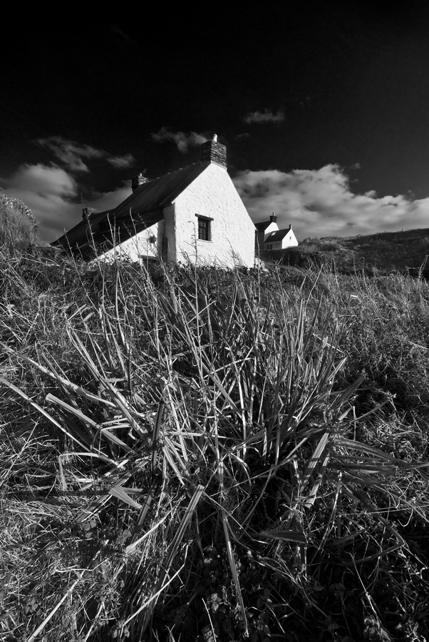
They depict different subjects but compositionally are very similar, with a single feature in the background and a texture in the foreground.
Perspective lines to central feature: In the below images, the whole composition is designed to draw your eye towards the main subject in the centre of the frame.
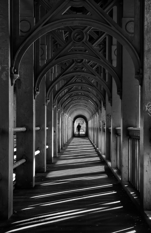

In all these examples, the subject matter is secondary to the visual effect. So try to think of your image not in terms of the subject or what you’re photographing, but in terms of shape, pattern or colour. You’ll produce stronger, simpler images.
Choosing your viewpoint (point of view)
Your point of view is very important in forming your image. A small change in viewpoint can make a big difference to the impact of your image.
Frosty mountain: In the first attempt, I tried using the light on the frosted grass as a lead-in line but it made the composition look unbalanced.
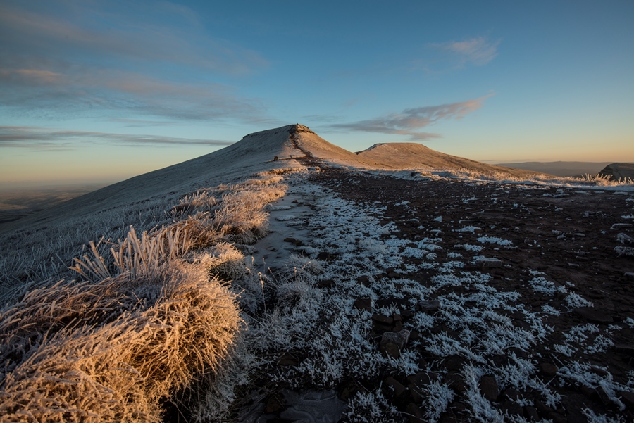
Filling the foreground with the light catching the grass drew the eye much more successfully to the peak and made a much simpler composition.
Sheep in the Brecon Beacons: Think how the subjects in your image relate to each other with your positioning.
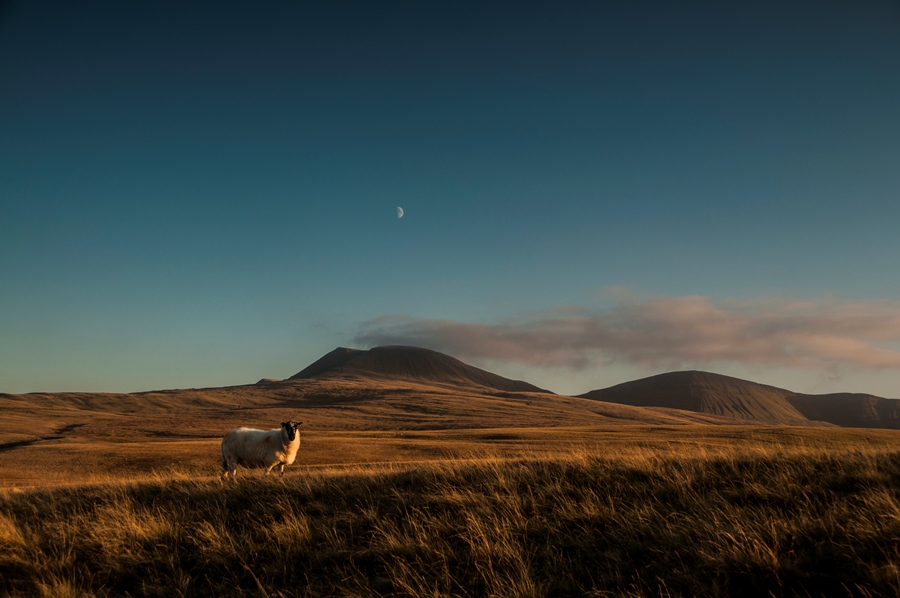
The moon, main peak and sheep are more closely aligned in the second picture, simplifying the composition. Placed to the left, the sheep draws the eye towards the background.
Choosing your moment
The light and weather are vitally important in landscape photography. Mist, cloud, snow and more can dramatically change the composition of your image. It is well known that dawn and dusk light are favoured by photographers, and that flat midday light rarely produces the best results, but don’t dismiss the differing images you can get in all kinds of lighting conditions.
Talybont Reservoir at Dawn: This shot was taken at dawn on a misty morning.
Mist is effective for simplifying compositions as it obscures detail and picks out simple shapes. I threw a stone in the water to add interest to the foreground and remove the symmetry.
Tree and sky: The two images below were taken within a minute or two of each other but are very different in impact due to the deepening of the clouds and the light on the tree.
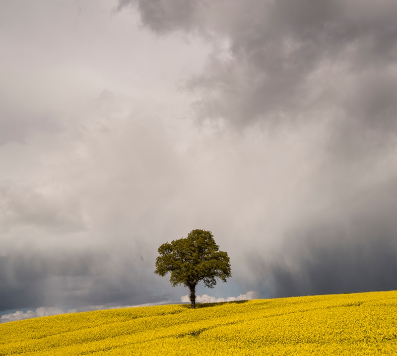
Hopefully you can see that all the examples here are simple images, containing very few features or elements, and it’s clear why they’ve been taken. This has been achieved by following the four rules outlined in this article.
Remember to think in abstract. Explore with your camera and find your own unique compositions rather than following the crowd and going to well-known locations, where at best you’ll get a variation on what has been taken many times before.
Try the following exercises
Themed compositions: Go to a place (say local town or village) familiar to you and look for ten simple compositions based on a theme (e.g. circles, lines, diagonals or rectangles). This will help you look for abstract forms rather than subjects or locations.
Portrait foreground/background: Try capturing five images with a foreground and background feature in portrait format. Portrait format is an effective way to draw a strong connection between foreground and background elements. It’ll help you identify what’s important in your image and what detracts.
Two rectangles: Take two images based on two rectangles in landscape format. Seascapes and skies are an obvious example but look for anything which forms a strong base for the image and draws attention to the sky.
Interpretation: Find a single subject (e.g. a bridge, a statue, a building, etc.), and look for as many different ways you can of photographing it. Explore it from all angles and viewpoints and look hard at each image to see how you can simplify or improve it.
Good luck with trying these out and I hope it helps you to improve your composition!
About the Author
Nigel Forster is an experienced tutor in landscape photography, a Master Photographer with The Photographer Academy and runs regular 1-1 and Group workshops throughout the year from his base in the Brecon Beacons, other great locations in Wales and other areas of the UK. For details visit www.creativephotographywales.com.
Related articles
Six Quick Tips for Better Portraits
Shooting Landscapes with an Ultra-Wide Lens
A Guide to Taking Photographic Hikes